Motorcycle Skin
 Development on this skin has been discontinued.

If you're just here to see the pictures, skip down to
The Menus.
Introduction
This is a skin designed specifically for use on a motorcycle. It differs considerably from the skins built into the iWay in appearance and operation, so please read this page carefully. (If you're in a rush to play with it, the current version may be downloaded from the list of attachments at the bottom of the page.)

This skin requires firmware version 1.7.0 or later and was tested using build
JR1400C.
Notes from the Developer
Any feedback you have on this skin is welcome. I'm especially looking for suggestions about what to do with the blank buttons.
If you want to customize the buttons in the
Finds menu, there is a set of images in
menus/m2/generic that has generic buttons for your favorites. Copy the files in that directory to
menus/m2 and customize
menus/m2/menu.skn to taste. Copies of the customized icons are in
menus/m2/custom.
If you're wondering, the curve shown in the background image is along the Kalaniana`ole Highway near Sandy Beach on the island of
O'ahu, Hawaii:
http://maps.google.com/maps?f=q&ll=21.292253,-157.662263&spn=0.053021,0.101709&t=h
You can drop me a line at this address:
mfeit (at) notonthe.net
Installation
Unlike skins provided by Lowrance, this one does not self-install.
- Download
motorcycle-skin.zip
- Unpack it into the
Skins directory.
-
 Make sure you tell whatever you use to unpack the file that it should unpack directories instead of dumping all of the files into one place. Otherwise, you'll be left with a mess in your iWay's
 Skins directory. If you don't understand this, see ZipNotes before proceeding.
- Using the
Default skin (or whatevever other skin you're using), turn the master volume all the way down before using this skin.
-
 The skin's volume control buttons change the volume in increments of 4, so if your control is set to something that's not an even multiple of 4 before using the skin, you won't be able to turn the volume all the way down.
- Set the
Transparency setting (under Screen Setup) to about 60%.
- Enjoy!
A very brief tour of how to get the skin selected and what the menus look like is available on YouTube at
http://www.youtube.com/watch?v=LZoOnMtLXB4.

If you are running any version of this skin downloaded between December 10, 2005 and July 4, 2006, you can determine what version it is by going to the
Utilities menu and holding the
Device Info button. The version number will appear in the button.

You can find the version of any skins downloaded after July 4, 2006 by going to menu 4 (
Everything Else) and pressing the
Credits button.
Design Elements
The color scheme provides good readability and contrast in daytime and nighttime situations. The map still poses a problem, but the solution may be two two versions of the skin with different map color schemes.
Frequently-used parts of the skin should are in easy-to-reach places. Anything on the right side of the unit (i.e., the hard buttons) is not easy-to-reach.
Most of the unit's features are can be used without ever touching the hard buttons.
On-screen buttons are large enough to make them easy to use for someone wearing heavy gloves.
Buttons make their function and state very clear:
- Icons are recognizable symbols or, where not immediately obvious, supplemented with text.
- All buttons provide visual confirmation when pressed.
- Toggle buttons turn a feature on or off instead of showing two named states.
- Toggle buttons are transparent if a feature is off and backlit in some color if it is on:
- Green - The feature one that would normally be turned on, such as
Auto Zoom.
- Orange - The feature is one that's usually turned off, such as
GPS Simulator.
The entire title bar on all dialog boxes functions as the close box. This means you can touch any spot along the top of the screen to close a window.

A bug in the 1.7.0 firmware prevents the titles from being properly displayed with a full-width close box, so the decision was made to do without the titles. This was not a problem in previous firmware.
The Map Page
Along the left edge of the map page are the following buttons:
- Orientation - Toggles between North-Up/Track-Up/3D mode (same as the default skin)
- Range/AutoZoom - Shows map scale and toggles auto-zooming (same as the default skin)
- Right Diagonal Arrow - Enters the menus. (See The Menus, below.)
- Keep Right Arrow - Skips to the next audio track.
Along the bottom are the following:
- Stop/Go - Serves the same function the Play/Pause button and was put on the map page as a convenient way to stop the music when traffic gets bad and concentration becomes important.
- Anchor - Saves the current location in the address book.
The Map Toolbar Page
Across the top is a button which closes the toolbar and returns to the map, same as with dialog boxes.

The
LargeButtonBug prevents the use of a proper button here, so the image is used as a stopgap.
Along the left side of the page are the following buttons:
- Orientation - Toggles between North-Up/Track-Up/3D mode (same as the default skin)
- Range/AutoZoom - Shows map scale
- Zoom In - Displays a smaller map area (same as on the default skin)
- Zoom Out - Displays a larger map ares (same as on the default skin)
Along the right side of the page are the following:
- Info ("?") - Shows information about the current position (same as the "i" button on the default skin)
- Pan Mode - Sets the map so dragging will pan.
- Zoom Mode - Sets the map so dragging a box will zoom into the box.
The menu system is driven entirely with your left hand with as few movements as possible until it's time to actually press a button.
The diagonal right arrow on the left side of the map screen enters the menu system.
All menus have three narrow buttons along the left side, from bottom to top:
- Next - Navigates forward to the next menu. On the last menu, this will return to the map.
- Prev - Navigates backward to the previous menu. On the first menu, this will return to the map.
- Exit - Closes the menus and returns to the map.
The
Prev and
Next buttons will wrap around when the beginning or end of the menus is reached (i.e.,
Prev from page 1 goes to page 6, and
Next from page 6 goes to page 1).

The menus will look far better on your computer screen than on the iWay, which only has eight graphics planes.

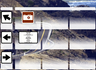
Button labels are generated by the firmware and do not appear in these images. See the table below each one for a description of each button.

You can see video of the menus at
http://www.youtube.com/watch?v=LZoOnMtLXB4.
The menus are laid out as follows:
1. Quick Picks
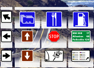
| Address Book |
Find Restaurants |
Find Gas Stations |
| Volume Up |
Cancel Navigation |
Trip Calculator |
| Volume Down |
GPS Status |
Default Main Menu |
2. Finds
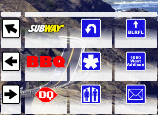
| Find Subway Subs |
Recently-Searched |
Find City/Town |
| Find Barbecue |
Find in Everything |
Find Address |
| Find Dairy Queen |
Find Rest Stops |
Find Stores |

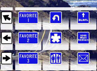
The image on the right shows the generic versions of the favorites buttons.
3. Navigation
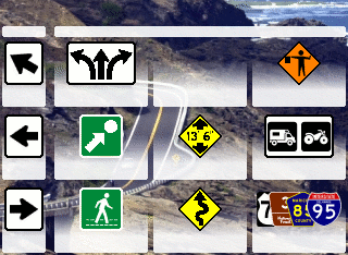
| Turn List for Current Route |
|
GPS Sumulator |
| Saved Route List |
Toggle Auto-Zoom |
TBT/Off-Road |
| Saved Trail List |
Toggle Turn Previews |
Set Routing Options |
4. Everything Else
5. Utilities
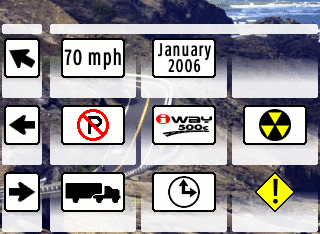
| Overlay Data |
Calendar |
|
| Categories |
Device Info |
Reset Options |
| Data Transfer |
Local Time Settings |
Safety Mode |
6. Audio
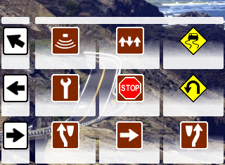
| Play Lists |
Equalizer |
Shuffle |
| Sound Setup |
Stop |
Repeat |
| Last Track |
Play/Pause |
Next Track |
Customization
To customize the three search buttons in the
Finds menu (Subway/BBQ/DQ), do the following:
- Copy the files in
menus/m2/generic into menus/m2. This replaces the buttons with the custom logos with generic ones that say Favorite 1, Favorite 2 and Favorite 3.
- Using your favorite text editor (Notepad or Wordpad on Windows if you don't have one), open
menus/m2/menu.skn.
- At about line 50, you'll find the beginning of the definition of the first custom button. Look for a comment that says
Row 1 Column 1.
- Further down, locate the
<Label...> section and change <text>Subway</text> to the text you want to appear under the button. (i.e., <text>Steak</text>.)
- A bit further down, you'll find a section that says What to do when clicked. In the
<param> section, there are up to three parts separated by colons:
- The first is the main category, such as
Restaurants.
- The second, if present, specifies a subcategory. For example,
Restaurants has a subcategory called Steak Houses, and you'd find those by specifying Restaurants:Steak Houses.
- The third, if present, is a name filter. If you wanted all steak houses starting with
P, you could specify Restaurants:Steak Houses:P*, where the asterisk indicates a wildcard.
-
 If you want to use a name filter on an entire category, leave the subcategory empty:
 Restaurats::Bob* would find all restaurants that start with Bob regardless of subcategory.
- Repeat for
Row 2 Column 1 and Row 3 Column 1.
- Save the file and exit the editor.
- Reboot your iWay and enjoy.
To-Do List
Better audio page.
- Remove the "no background" comment from
AudioPage.skn
Add a button to bring up the
Languages page.
Add a button to bring up the
Units of Measure page.
Add a button to bring up the
Screen Setup page.
Finish new versions of controls:
- Icons:
- Folder
- Song File
- Song List
- Unknown Image
- Play All
Version History
4 - July 4, 2006
- Complete overhaul of file and menu structure
- Slightly new appearance
- Added support for new features in 1.7.0
- Text rendered by firmware instead of in graphics
- Volume Up/Down buttons on
Quick Picks page instead of slider
- Added generic background/buttons for the
Finds page
- Hard buttons now bring up pages from the
Default skin
3 - February 12, 2006
- No longer beta... This thing's cooked long enough.
- Added graphics to the
Utilities menu
- Made very minor tweaks to some of the icons in other menus
- Re-set all type in Roadgeek 2005 Series 2W
- This will be the last version until Lowrance releases new firmware.
2 - December 10, 2005
- Added
Save Waypoint ("Anchor") button
- Added sliding volume control and re-arranged
Quick Picks buttons
- Changed the
Main Menu button to white so it matches the theme of the other buttons used for navigating the menus.
- Added
Everything button to Finds page.
- New
Utilities page
1 - November 20, 2005
Administrivia
License
This skin is Copyright 2005-2006 by Mark Feit, who reserves all rights.
Any party may download, use, modify and redistribute this skin free of charge provided the copyright notice in the
README file is left intact. Modified versions must clearly indicate that they have been modified.
Lowrance Electronics, Inc., its subsidiaries and agents are free to download and use this skin but may not redistribute it in whole or in part without the consent of the author.
Legal Disclaimer
The standard warnings about using your iWay in any moving vehicle while you're the driver still apply. If you ride your motorcycle into a wall while using this skin, the only other party you may involve in a lawsuit is the wall. (Isn't it nice that we have so many lawyers in the world?)
Credits
A number of the road sign images are based on Optic Nerve Animation's
Ultimate Highway Sign Pack:
http://www.turbosquid.com/FullPreview/Index.cfm/ID/224202
Most text is rendered with Mike Adams'
Roadgeek 2005 series fonts:
http://www.triskele.com/fonts.
The iWAY 500c logo which appears in the
Device Info button is Lowrance's trademark. Hopefully they don't mind my using it here.
Thanks to the family for putting up with me while I work on this.
Ancient History
The first version of the buttons for this skin looked like this:
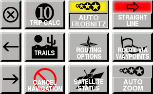
These never made it beyond experimentation because the early '90s called and said it wanted its
Motif-style buttons back.

In the first through third releases of the skin, the buttons looked like this:

 Make sure you tell whatever you use to unpack the file that it should unpack directories instead of dumping all of the files into one place. Otherwise, you'll be left with a mess in your iWay's
  The skin's volume control buttons change the volume in increments of 4, so if your control is set to something that's not an even multiple of 4 before using the skin, you won't be able to turn the volume all the way down.


 If you want to use a name filter on an entire category, leave the subcategory empty:

 Copyright © by the contributing authors. All material on this collaboration platform is the property of the contributing authors.

